Thursday, March 9, 2017

Be My Neighbor: Designing for the Mid-Century Modern Nature Lover

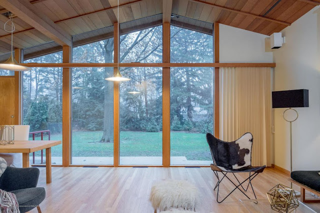
Today's design plan is for a fabulous mid-century modern home that is for sale in my neighborhood.
 
I thought the house would be perfect for one of my best friends from college and her family of four. 

Back in the day, Meg was a great lover of moose so when I saw this set of antlers for sale, my design plan came together around it. I added in the moody colors I associate with Holland & Sherry Interiors -- the landscape below the moose antlers is by photographer Martin Scott Powell available here and below it is their Doug & Gene Meyer rug in a room by Frank de Biasi. To further get the nature-loving feel that is perfect for this house, I rounded out the design plan with some prints from John James Audubon's Birds of America.


How about those windows and that view?!? Breathtaking!!!

There is a pending offer on the house -- whomp, whomp. According to this realtor's site they are accepting backup offers, though.  It is $274,900 for a 3 bedroom, 2 1/2 bath home in East Lansing's Lantern Hill neighborhood and was built in 1951 by Frank Lloyd Wright's draftsman Robert Goodall.


Although the square footage is listed at only 1,447, there is all this space in the lower level... {and frankly, it looks like a lot of closet space for a mid-century house, too.}

Monday, February 27, 2017

Sunroom in Winter

Did you watch the Oscars last night? The last time -- only time?? -- I have watched the whole show was a dozen years ago while visiting my parents at a vacation rental on Dauphin Island. It was fabulous because a.) I didn't have to get up for work the next day, b.) the show was aired in the Central timezone so it started and ended earlier, and c.) we were sitting on big, plushy floral sofas.

Anyway, this actually does relate to the design plan I've come up with for today. I was inspired by this bamboo sofa from Etsy for the TV room at my parents' house in snowy northern Michigan.


Cassandra's Finds on Etsy

It costs $599 plus whatever the cost for it to be shipped from Florida. The upholstery also needs to be updated because there is a tear on the back side.


My mind quickly began filling in those blanks. I pictured a seersucker print for the cushions. Warning, once I started shopping for fabric I realized that it would need something heavier-duty than apparel fabric or else it would not withstand the normal wear and tear of household use. 

Society Social


This is a good visual for what it could look like with the right upholstery fabric. A good ol' stripe in a cabana color.

Tommy Bahama
This Tommy Bahama print would be ridiculously fun, don't you think?! Ultimately it was not the look I wanted for their space, though. Here's a design board showing the look I pictured for them. 


The sofa would be warmed up with cozy throws and pillows in extremely soft fabrics like pink mohair. The pair of wingback chairs, chinoserie planter, and bust all add to the more formal sitting room vibe. The couch itself, the indoor-outdoor rug, and tables lean more toward a casual sunroom atmosphere.

Besides being inspired by the sofa, I thought it would be a great way to incorporate this rug that I purchased for the first One Room Challenge in my own house. It's an indoor/outdoor material by Safavieh. I would layer it right over the wall-to-wall carpeting for some pattern and extra cushion. Currently, it's being stored in my laundry room. I bought mine at Zinc Door but it's also sold by Kohl's and, for the right person, I might sell my used one.

In the end, my mom decided not to buy a new sofa based on my design whim so, as of right now, it's still available for sale. It could be used with my design plan in someone else's home, or once that one is sold, you could try to find a similar sofa elsewhere. The sofa in the design plan is this one from Serena and Lily. It's about 5 times as expensive as the one from Etsy but does come in buffalo check which would be SO FUN!!!

Saturday, February 18, 2017

Dressing Room Design

Imagine dedicating an entire room just to your wardrobe... Can you picture it? A place to not only store your clothing but to actually display it. There'd be space for your skirts and blouses to stretch out, making it so much easier to see what you have. Instead of scarves and belts being buried in drawers or hidden behind closed doors, they could serve as the decor in the room. Same for bags and shoes.

And why not? We have a room for dining even though we may eat takeout on the couch while binge watching episodes of Riverdale. {Are you watching this show?! So good!}

Creating a stylish dressing room was the design challenge I was recently given. I chose the industrial globe pendant in antiqued brass for my room design. It's on sale for what I consider a decent price ($179.10) and since this is all make-believe anyway, I chose three. It would be the right amount of light for the space.
Another lighting option that would be even more affordable is the Henri swag kit in bronze for $71.10. While it's intended to be used with a shade, I would use it without in order to keep the glam-industrial feel. Also available from Arhaus.

Since my pretend dressing room is a converted bedroom, I decided on a pair of bookcases with an upper and lower rod between the two for blouses on top and slacks/skirts on the bottom. The Billy Bookcase from IKEA would work great for this purpose. Shoes, bags, belts, and other accessories would be displayed on the open shelves. Inside the cupboards, I would store the necessary things that I don't want everyone to see. Dress forms would be a fun addition for holding scarves or trying outfits.

An upholstered lounging chair and privacy screen would allow me to get dressed while visiting. Another bonus of the screen is that it brings in some big pattern. I'd love to give a DIY screen a try with one of the new fabrics from Liberty of London. Oscar Wilde said that "Liberty is the chosen resort of the artistic shopper" which seems a fitting recommendation for a room dedicated to the art of getting dressed.


A big beautiful mirror, a small end table, and a bench with some texture round out the design. I could also imagine a vanity table in this room -- I would add some skirting in a contrasting fabric and a tilting mirror for putting on my face.

What would you do with an extra bedroom? Do you need help pulling a room together? I would love to help design your space!

Tuesday, November 22, 2016

Dining Room Dilemma

Thanksgiving may be my favorite holiday. It's at least in the top three, for sure. Although making dinner every night is beyond my capabilities, hosting this holiday feast is something I have volunteered for many times. 

This year we are headed elsewhere, but I am still thinking about my dining room. 

Specifically, I am thinking of the light fixture and floor covering. 

Here are a few images of what the space looks like:

Dining room from the kitchen


Dining room from the front door


Dining room from the den

I really love the light fixture that is there now. It's so unique to the era in which our house was built. However, it doesn't feel appropriate to a dining area or the mood I'm trying to create in there. You know what would fit, though?
 

One of those fake fancy lights from the 1970s or 1980s. I've done a bit of research on this style and it's actually quite high end and from Italy and ... mid-century! Who knew?!

I love thinking about the way the light would reflect off the black back wall if we had a light like this over the table. It would make me want to throw on a sequined evening gown to serve frozen fish sticks, elevating Taco Tuesday to the level of an event. Totally the way I want to live life.

The dilemma is that there is another option which my husband approves and that would also be fine, just not nearly so cool as THIS...

For the floor, we currently have a perfectly fine rug -- that I really don't love. It's a tad too small. I've angled the table and chairs to fit as well as they possibly can but it's a 5x7 and just not totally appropriate for the size of the table. A more suitable size would be an 8x10. I want to be able to pull the chairs out and still be on the rug. Is that so much to ask?

I've also been wanting to incorporate a sisal rug into my home design somewhere. This seems like as good a spot as any. There is this one, from IKEA, which I didn't even know was a thing until I read this post today (oh, if only an IKEA would open near my home, then I would know these things!!):
There is also this one which has silvery threads woven into it. It's lurex, which is defined as:
  1. a type of yarn or fabric that incorporates a glittering metallic thread. 1940s: of unknown origin.

They are the same price and incredibly affordable for an 8x10 (only $150, although the lurex is on sale). I love that the origin is from the 1940s, which also fits the mid-century vibe of our home. 

When I think of designing mid-century modern for today's home, I don't want to be limited to sputniks and tulip tables (much as I love both those things). I want to do something fresh and fun. This room would sparkle, literally!


Here are a few more shots of the room via Instagram.


Detail on the bar: with more art / without a tray


Dining room full of people


And, since yesterday I wrote about my daughter's room re-do, here's a progress shot from this summer with the duvet cover on her bed and the new paint color.

LinkWithin

Related Posts Plugin for WordPress, Blogger...