There was a big beautiful moon out our front window at dinner last night, and a big bright moon from the back window this morning. Which means I had nightmares and insomnia...
In ONE of my zombie dreams last night I got to meet a favorite interior designer. Tobi Fairley has been featured in Traditional Home and on HGTV as well as decorating celebrity homes. But, last night, she was just another one of the refugees from the zombie apocalypse. We were all staying in this truly beautiful home in order to figure out how to battle back against the face eaters. It was quite cinematic. Of course, I introduced myself to her. :) Then a zombie burst through the floor and I ran to hide while the warriors fought off the zombies...
In honor of the dream, here are a few of my favorite images from Tobi's portfolio.
This image is from Energy House. I seriously love that name!
Also from Energy House.
From
Inverness Circle... You can just get a glimpse of the way she uses
black & white in this design from the reflection in that big
sunburst mirror over the sofa.
Here's a black & white shot from Inverness Circle. I love how rich the gold frame looks against the black & white. I am also partial to the origami animals in the glass box since Griff is working on a school project about origami right now.
This is from Mediterranean Estate. I like the series of framed pieces on the wall (can't really tell what they are, maybe sheets of music??). Up, up, up has been a theme I've been thinking about in my own space lately so I'm happy to see it used here.
Similarly I like this series of wall hangings, particularly so because of the sea-creature theme.
From Build for a Cure.
Just when you think you know what the color scheme is going to be, she switches it up on you, which keeps it very fresh. Love these book spines and the bouquet of roses. From Build for a Cure.
This kitchen from La Marche features a gorgeous banquette as well as lots of fun fabrics.
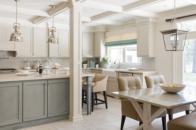
This kitchen is from Pleasant Valley, which was one of Tobi Fairley's favorite projects and how I first learned about her. In fact, this is a wider view of the bar featured in a post I wrote way back in July. The paint color on the cabinets is Sherwin Williams Topsail SW 6217.
In fact, color is my favorite aspect of Tobi Fairley's designs. I must not be the only one who feels that way because Benjamin Moore has teamed up with her to offer another contest (remember the Layla Grace dining room contest? Judged by none other than Tobi Fairley!).
This one is the 2013 Color Trend Design contest, and four winners will attend design camp with Tobi. How fun!
What do you think the color trend will be for 2013?? Leave a note in the comments to let me know!


No comments:
Post a Comment
Thanks so much for commenting! I love to read what you have to say. ~Carrie
Note: Only a member of this blog may post a comment.